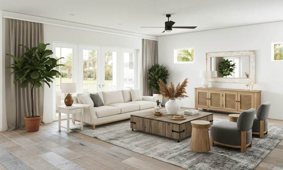
The palette
#EFF1EE
#D6CBB4
#C9BBA0
#3E6B7C
#C8CFC9
These are the actual values, not an impression of them — take them to a paint supplier and have them matched.
What it actually is
Coastal style has shed the nautical costume it had twenty years ago. What is left is simply a pale, airy, natural-fibre scheme with low contrast and one blue in it.
That change is worth understanding, because the literal version — shells, anchors, rope — is the single thing that now makes a room look dated and slightly embarrassed. Everything good about the style survives without any of it.
The one thing that decides whether it works
Daylight. More than any other style here, this one depends on light it did not create. Pale cool surfaces in a bright room read as airy and fresh; the identical surfaces in a north-facing room with small windows read as grey and cold.
So the first decision is not the palette. It is whether the room can carry it — and if it cannot, the honest answer is to pick a style built for low light instead.
The materials
Get these right and the colours matter less than you think. Get them wrong and no paint colour rescues the room.
- Bleached and limed timber
- Pale, slightly grey-warm oak, limed or white-oiled. The reference is driftwood: sun-faded rather than grey-stained, which is a different and much worse thing.
- White cotton and sheer linen
- Loose covers, light curtains that move. Fabric that filters light rather than blocking it, because light is the whole premise.
- Rattan, jute and seagrass
- A jute rug, rattan pendant, woven baskets. Natural fibre is the texture layer and it does a lot of the work.
- Matt ceramic in chalky glazes
- Soft white, pale blue, sand. Matt or lightly satin, never high-gloss.
- Weathered or pale metal
- Brushed nickel, pewter, soft chrome, or painted timber instead of metal. Warm brass tends to pull the scheme somewhere else.
Techniques that produce the look
- Start with the light, not the palette
- Maximise what daylight you have — sheer or no curtains, pale surfaces, a mirror opposite the window. A coastal palette in a dark room just reads as cold, and no colour choice fixes that.
- One blue, used three times
- A single deep blue, repeated in three places at different scales: cushions, a lamp, a piece of art. Several different blues is what makes it look like a theme rather than a scheme.
- Keep contrast low
- Everything except the one accent sits within a narrow range of pale tones. Strong contrast makes the room feel heavy, which is the opposite of the point.
- Texture instead of pattern
- Jute, rattan, rough linen, chunky knit. The natural-fibre texture gives the room depth without introducing any more colour.
- Horizontal lines
- Wide floorboards, horizontal panelling, low furniture. Horizontal reads as calm and as horizon, which is the reference.
What takes the look apart
- Seashells, anchors, rope details, driftwood signs, anything nautical and literal.
- Navy and white stripes everywhere, which turns it into a costume.
- Grey-stained timber. Faded, not grey.
- More than one blue.
- Cool-white lighting, which makes the pale palette feel clinical rather than airy.
Common questions
- How do I keep coastal from looking themed?
- Remove every literal object. No shells, no anchors, no rope, no nautical lettering. What is left — pale bleached timber, white cotton, jute, one deep blue — is a neutral scheme with a sea-coloured accent, and it reads as coastal without announcing it.
- Does coastal work away from the coast?
- Yes, because the modern version is really a pale, airy, natural-fibre scheme. It depends on daylight far more than on geography, so a bright inland room suits it better than a dark one by the sea.
- What if my room is dark?
- Choose a different style, or shift this one warmer. Coastal is built on abundant daylight, and in a dark room the pale cool palette reads grey and cold. Scandinavian or warm minimal handle low light far better.
- Which blue should I pick?
- A deep, slightly grey-green blue rather than a bright or primary one — something closer to deep water than to a flag. Pick one and repeat it; the discipline matters more than the exact shade.