The palette
#EAE5DB
#B99B74
#BDB3A3
#2B2724
#5E6B51
These are the actual values, not an impression of them — take them to a paint supplier and have them matched.
What it actually is
Japandi is a genuine overlap rather than a marketing hybrid. Japanese and Scandinavian design arrived at similar conclusions from different directions: both value natural materials left close to their raw state, both prize function, and both treat empty space as something positive.
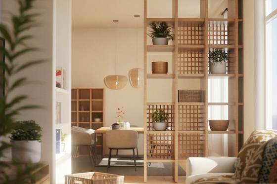
What Japan adds to the Nordic version is discipline and craft. Lower lines, far more restraint, a visible respect for how something is made, and the thin black line that gives the composition its structure.
The one thing that decides whether it works
Craft, not colour. This is the most imitated and least successfully copied style of the current decade, and the failure is always the same: the palette is right and nothing in the room is any good.
A beige room with four cheap objects in it is not Japandi. The style removes so much that whatever remains is fully exposed — the joint on the table, the glaze on the bowl, the weave of the linen. Fewer, better things is not an aesthetic preference here; it is a structural requirement.
The materials
Get these right and the colours matter less than you think. Get them wrong and no paint colour rescues the room.
- Warm mid-tone oak
- Darker and warmer than the Scandinavian version. Oiled, never lacquered. The grain should be visible and the surface should feel like wood rather than like a coating.
- Paper, rattan and cane
- Screens, pendant shades, cabinet fronts. These carry the Japanese half of the style and filter light rather than blocking it, which is the whole point of them.
- Unglazed and matt ceramic
- Stoneware with a visible, slightly irregular surface. Flawless factory-glazed pieces read as the wrong style; this one wants the hand to be visible.
- Ink-black linear elements
- Thin black frames, slim black legs, a black-stained batten. Used as a line in the composition, not as a mass.
- Heavy natural textiles
- Thick linen, raw cotton, undyed wool. Weight and texture do the work that pattern would do in other styles.
Techniques that produce the look
- Lower the horizon
- Low furniture, low shelves, art hung lower than instinct says. A low horizontal line is the single most recognisable Japanese element and the one most people miss.
- Negative space as a material
- Leave a third of every surface and wall empty, deliberately. In this style an empty wall is a feature you chose, not a wall you have not got round to.
- Two timber tones at most
- One for the floor, one for the furniture, and let them be clearly different rather than nearly the same. Three or more tones reads as accumulated rather than designed.
- Filter the light
- Paper, linen or cane in front of a light source instead of a bare bulb or a bright shade. Soft, directional, low.
- Hide the storage completely
- Flat, handleless fronts in the same tone as the wall or the timber. Visible clutter is the thing this style has least tolerance for.
What takes the look apart
- Treating it as beige minimalism. Without the black lines and the craft in the materials it is just an empty room.
- Tall, bulky furniture, which breaks the low horizontal line the style depends on.
- Cool grey. Everything here sits on the warm side of neutral.
- Glossy finishes anywhere, including the floor.
- Too many timber tones — the fastest way to make it look accidental.
Common questions
- What is the difference between Japandi and Scandinavian?
- Japandi is warmer, lower and more disciplined. Scandinavian runs pale and cosy with plenty of soft layers; Japandi uses deeper timber, keeps furniture low and horizontal, adds thin black lines, and removes far more. Scandinavian tolerates clutter; Japandi does not.
- Does Japandi work in a small flat?
- Very well, because low furniture and empty surfaces both make a space read as larger. The constraint is storage — the style has no tolerance for visible clutter, so you need enough concealed storage before you start.
- What colours can I add without breaking it?
- A single muted natural tone, used sparingly: moss green, clay, soft terracotta, indigo. One at a time, in textiles or ceramics rather than on the walls. Anything bright or saturated will fight the whole scheme.
- Is it expensive?
- The materials are not, but the restraint is demanding and the craft shows. A room with four well-made pieces costs more than one with twelve cheap ones, and in this style there is nowhere for a poor piece to hide.