The palette
#E7DFCF
#9C6B3F
#4E6B52
#C96A3C
#C8A14A
These are the actual values, not an impression of them — take them to a paint supplier and have them matched.
What it actually is
Mid-century modern is roughly 1945 to 1970, and it came out of new manufacturing: moulded plywood, foam, tubular steel and bent timber made shapes possible that had not been before. The furniture is light, it stands on slim legs, and it was designed to be mass-produced and affordable.
The colours came from the same period — forest green, burnt orange, mustard, teal — and they are confident in a way that most current palettes are not.
The one thing that decides whether it works
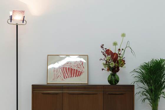
Restraint with the colour, generosity with the timber. The style is usually reproduced backwards: lots of bold colour and not much good wood. The original rooms were mostly warm timber and warm neutral, with one or two saturated pieces doing the work.
The other reliable rule is the legs. Furniture lifted off the floor on slim tapered legs is the detail that makes these rooms feel airy. Put the same palette on heavy furniture sitting flat on the floor and the whole effect disappears.
The materials
Get these right and the colours matter less than you think. Get them wrong and no paint colour rescues the room.
- Teak, walnut and rosewood
- Warm, mid-to-dark, with strong visible grain. Oiled rather than lacquered. This is the material the whole style is built on, and no palette choice compensates for getting it wrong.
- Brass and warm metals
- Unlacquered brass that darkens with handling, on legs, handles and light fittings. Chrome belongs to a different decade.
- Wool and bouclé
- Flat-weave wool, tweedy textures, bouclé. Textiles with a visible weave rather than smooth flat fabric.
- Saturated colour, used flat
- Forest green, burnt orange, mustard, teal. Blocks of solid colour rather than patterns — the colour is confident but it is never busy.
- Smoked glass and ceramic
- Smoked or amber glass, matt glazed ceramic in earthy tones. Small, and used as punctuation.
Techniques that produce the look
- Lift everything off the floor
- Tapered legs on the sofa, the sideboard, the chairs. Seeing the floor run underneath is the detail that makes a mid-century room feel light rather than heavy, and it is the single most reliable rule in the style.
- One bold colour, then stop
- A green sofa or an orange chair, not both plus a mustard rug. The palette looks brave because it is used sparingly against a lot of warm neutral.
- Horizontal over vertical
- Low sideboards running long, art in landscape, shelving that spans rather than stacks. The style's proportions are wide and low.
- Mix timber tones on purpose
- Unlike Japandi, this style tolerates and even wants two or three timber tones, as long as they all sit warm. Cool-toned grey timber is what breaks it.
- Keep walls plain
- Warm cream or soft white, flat finish, and let the furniture and the timber do the talking. A feature wall in this style is almost always a mistake.
What takes the look apart
- Buying a whole room of reproductions at once, which reads as a showroom rather than a home.
- Chrome and cool greys, which pull it towards the 1980s.
- Pattern on top of the colour. The colour is the statement; pattern makes it noise.
- Heavy furniture sitting flat on the floor, which cancels the lightness the whole style depends on.
- Cool-white lighting, which turns the warm timber grey.
Common questions
- Do I need original pieces?
- No, and a whole room of originals often looks like a museum. One or two genuinely good pieces — original or a well-made modern design — against plainer things reads far better than a complete matching set, and costs a fraction.
- What wall colour works best?
- A warm cream or soft off-white, flat finish. The style's colour lives in the furniture and textiles, so the walls are there to let warm timber and a saturated sofa read clearly. Cool or grey whites fight the timber.
- Can I mix it with other styles?
- It is the most mixable style on this site. Mid-century furniture sits comfortably in a Scandinavian or minimal room, because the proportions are quiet even when the colours are not. Keep the timber tones warm and it generally works.
- What flooring suits it?
- Warm mid-tone timber — teak, walnut or oak stained warm. Parquet, including herringbone, is very much in period. The thing to avoid is anything grey or cool-toned.