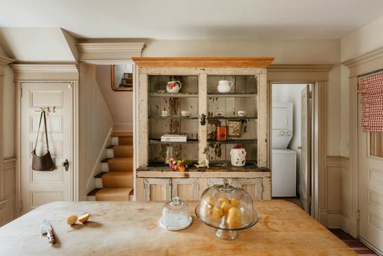
The palette
#EFE8D9
#9FAAA8
#A98455
#B9775A
#8A8B85
These are the actual values, not an impression of them — take them to a paint supplier and have them matched.
What it actually is
French country — the Provençal and rural version rather than the Parisian one — grew out of farmhouses where good pieces were kept for generations and repainted rather than replaced. That is why the look is formal shapes in informal condition: the furniture was once grand, and then it was lived with.
The palette comes from the materials available: lime-washed walls, limestone and terracotta floors, oak beams, and one soft colour on the joinery.
The one thing that decides whether it works
Wear in the right places.
Distressing is the part everyone gets wrong. Real wear happens where hands, hips and feet go — the edge of a drawer front, the arms of a chair, the strip of skirting a chair rail rubs against, the front edge of a worktop.
Factory distressing is applied evenly all over, including places nothing could ever rub. The eye spots it instantly, even when it cannot say why. If you are ageing a painted finish yourself, think about how the piece would actually be used and only sand there.
The materials
Get these right and the colours matter less than you think. Get them wrong and no paint colour rescues the room.
- Painted timber with wear
- Cabinetry and furniture in chalky paint, rubbed through at the edges where hands and hips go. The wear has to be in the right places or it looks like a craft project.
- Aged oak
- Beams, worktops, dressers, floorboards. Mid-tone and matt, never glossy, with the saw marks and movement left visible.
- Limestone and terracotta
- Floors in large irregular formats, worn smooth. These are the surfaces that make a French country room feel old rather than decorated.
- Toile, ticking and linen
- Small-scale traditional print used sparingly against a lot of plain. One patterned element per room is the usual limit.
- Pewter, zinc and aged brass
- Soft, dull, slightly tarnished metals. Bright chrome is wrong in a way that is immediately obvious.
Techniques that produce the look
- Pair a formal shape with a worn finish
- A carved chair in flaking paint, a gilt mirror with the gilt gone, a grand dresser in chalky blue. That specific contrast is French country, and without it you have either a formal room or a rustic one.
- One pattern, then stop
- A toile curtain or a ticking cushion, against plain everything else. The style is often parodied as floral chaos; the real thing is mostly plain.
- Let the timber be structural
- Exposed beams, a timber worktop, a dresser that fills a wall. The wood is architecture here, not an accent.
- Use blue-grey as the only colour
- A single soft blue-grey on cabinetry or joinery, with everything else in cream and natural. One colour, used confidently, in a whole room.
- Display the useful things
- Open shelving, a plate rack, hanging copper, glazed dresser doors. The storage is the decoration.
What takes the look apart
- Heavy floral on every surface, which is the cliché rather than the style.
- Bright white paint. Everything here is a warmed, chalky off-white.
- Factory-distressed furniture with the wear in implausible places.
- Chrome and high gloss anywhere.
- Overfilling. A French country room is generous but not crowded.
Common questions
- What is the difference between French country and English country house?
- French country is lighter, chalkier and more pared back — cream, blue-grey, stone floors, painted furniture. English country house is darker, warmer and denser — ochre and deep red, patterned fabric, books, layered rugs. Both are worn, but one is airy and the other is cosy.
- Is this the same as shabby chic?
- Shabby chic is a 1990s commercial descendant of it: more pink, more white, more deliberate distressing, far more ruffles. French country proper is plainer, warmer and considerably more restrained.
- How do I get the painted finish right?
- Chalky matt paint, then light sanding only where real wear would occur — handle edges, the front of a drawer, a chair rail where legs rub. Random all-over sanding is what makes distressing look fake.
- What floor suits it?
- Limestone or terracotta in large irregular formats, or wide aged oak boards. Whatever you choose should look like it could have been down for fifty years, which usually means matt, slightly uneven and warm-toned.