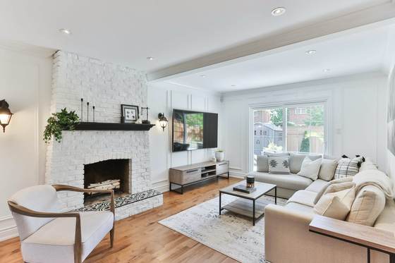
The palette
#EDE9E1
#C3BAAC
#7A5B3C
#34312B
#A9ADAA
These are the actual values, not an impression of them — take them to a paint supplier and have them matched.
What it actually is
Transitional is a compromise with a good reason behind it. Most people live in houses with some period character and want furniture that is comfortable and current. Furnishing strictly in period is expensive and often uncomfortable; stripping the character out is destructive and usually regretted.
So transitional keeps the architecture and modernises everything in front of it. Cornice and panelling stay. The carved mahogany goes, and a plain linen sofa arrives.
The one thing that decides whether it works
Something has to be interesting. The palette is deliberately quiet, the shapes are deliberately simple, and if you stop there you get a room that nobody dislikes and nobody remembers.
The fix is specific and cheap: one strongly textured material, one piece with real presence, and a firm dark accent to give the eye somewhere to land. Without those three, transitional is just beige.
The materials
Get these right and the colours matter less than you think. Get them wrong and no paint colour rescues the room.
- Painted timber trim
- Skirting, architrave and panelling with classic profiles, painted in the wall colour. The architecture carries the traditional half of the style so the furniture does not have to.
- Mid-tone timber
- Walnut or warm oak, in a simple shape. Grain visible, no ornament. This is the bridge between the old architecture and the new furniture.
- Textured neutral upholstery
- Linen, bouclé, heavy cotton in greige and warm grey. Simple shapes with a classic silhouette — a rolled arm is fine, a carved leg is not.
- Natural stone, honed
- Marble or limestone with soft veining, honed rather than polished. One surface, used properly.
- Mixed metal, two at most
- Brushed nickel or soft brass for fittings, matt black for frames and handles. Two finishes used consistently reads as considered; three reads as accidental.
Techniques that produce the look
- Old bones, new furniture
- Keep or restore the cornice, the panelling, the fireplace. Then put plain contemporary furniture in front of it. The tension between the two is the entire style.
- Hold the palette within three steps
- Everything within a narrow band of warm neutral, with one darker accent. The restraint is what lets the architecture read.
- Symmetry, then break it once
- Pairs of lamps, matched chairs, a centred fireplace — then one asymmetric element so it does not look like a hotel lobby.
- Texture instead of pattern
- Bouclé, linen, a textured rug, a honed stone. With this little colour, texture is the only thing stopping the room going flat.
- Scale the furniture to the room
- Transitional rooms fail on proportion more than on colour. Measure before buying, and leave walking space around everything.
What takes the look apart
- Buying a matched furniture set, which is the fastest route to a showroom.
- Beige everywhere with no accent and no texture — the classic bland failure.
- Three or more metal finishes.
- Heavily carved or ornate furniture, which pulls it into traditional.
- Ignoring the architecture. Without the trim and the proportions this is just a plain room.
Common questions
- What is the difference between transitional and contemporary?
- Transitional keeps traditional architecture — cornice, panelling, classic proportions — and puts simple modern furniture in it. Contemporary strips the architecture back as well. If the room has good period detail, transitional works with it; contemporary works against it.
- Why does transitional so often look bland?
- Because the palette is deliberately quiet and people stop there. The style needs texture and one firm accent to come alive: a bouclé chair, a honed stone surface, soft black frames. Quiet is not the same as empty.
- Does it suit an older house?
- It is the natural answer for one. You keep the cornice, the fireplace and the proportions, and you do not have to furnish in period. That is exactly the problem transitional exists to solve.
- Is it a safe choice for resale?
- The safest on this site, which is both its strength and its limit. A neutral palette with good architecture appeals to almost everyone. If you want the room to say something specific about you, pick another style.